Commercial Add-on · Built on DesignFoundation

Stop building screens.
Start shipping your app.

DesignFoundation Pro ships 55 production-ready SwiftUI screens across 12 verticals, 30 composite UI blocks, and 18 shell layouts — plus 12 wired composition examples you can run as-is or steal from. Theme with one modifier, wire your data layer, ship.

55
Full Screens
30
UI Blocks
18
Shell Layouts
12
App Verticals
$149
One-time · No Subs

See every block, screen, and shell before you buy.

DFPlayground is a free companion macOS app with the complete Pro catalog built in. Browse all 30 blocks, 55 screens, 18 shells, and 12 composition examples — live, interactive, and themeable. Open any screen in its own window. Switch between all five theme presets. Then decide.

⬇  Download DFPlayground — Free · macOS · 14.6 MB

Days, not sprints
Every screen is a complete, themed, accessible unit. Drop DFAIChatThreadScreen into your app and your AI chat is done. No design decisions. No accessibility wiring.
Everything theming
Every pixel obeys your DFTheme. Swap the entire visual identity of 55 screens and 30 blocks with one modifier at the app root. Slate, Aurora, Copper, Sage, Garnet — or your own tokens.
One purchase. Forever.
$149 per developer, unlimited projects, no seat tax. Annual updates are optional — your license never expires and nothing ever locks or degrades.

Screens. Blocks. Shells. One package.

Three product layers, one license. Wire up a complete screen vertical in minutes, compose with blocks, or use shell layouts to nail your app's navigation skeleton.

Full App Screens
55
  • AI Chat — Thread, New Chat, Compare models
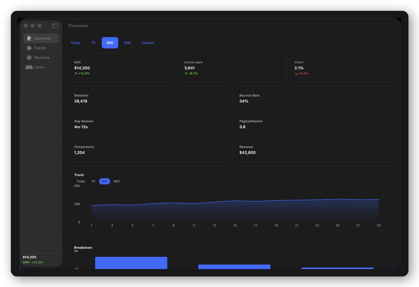
  • Analytics — Overview, Revenue, Users, Events
  • Booking — Service selection, Schedule, Confirmation, My Bookings
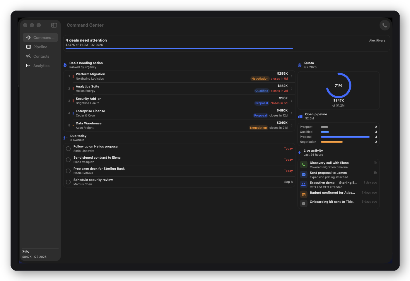
  • CRM — Home, Contacts, Pipeline, Deals, Analytics
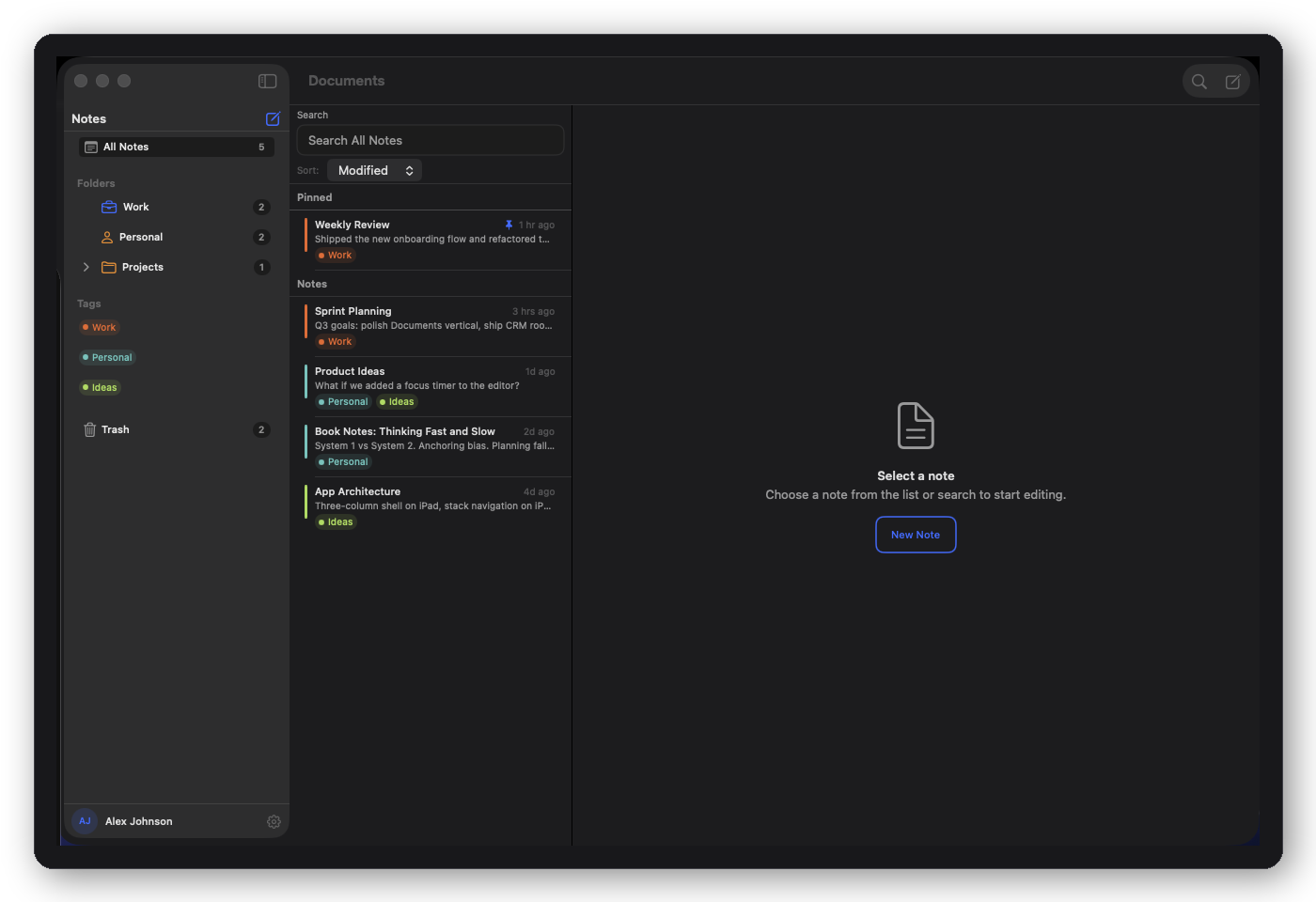
  • Documents — Browser, Editor, Search
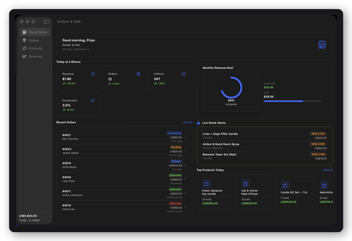
  • E-commerce — Store Home, Products, Orders, Revenue
  • Food — Restaurant home, Restaurant detail (menu), Item detail
  • News — Article list, Article detail
  • Onboarding — 10-screen complete flow
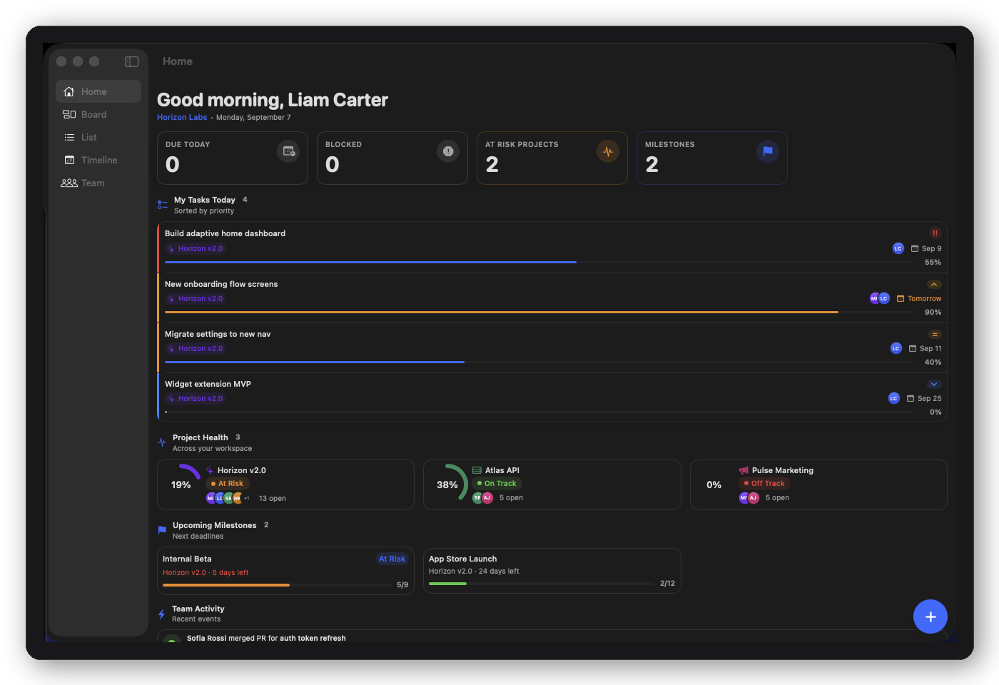
  • Project Manager — Board, Timeline, List, Team
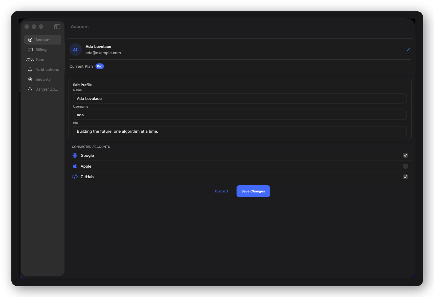
  • Settings — Account, Billing, Security, Team
  • Social — Feed, Explore, Profile, Notifications
UI Blocks
30
  • Auth — 5 blocks (welcome, sign-in, sign-up, forgot pw, OTP)
  • Dashboard — 7 blocks (stat, metric grid, progress ring, line chart, bar chart, donut chart, loading slot)
  • Onboarding — 4 blocks (carousel, permission, plan, success)
  • Settings — 4 blocks (section, account, notifications, danger zone)
  • Forms — 4 blocks (tag picker, date range, address, multi-step)
  • Feed, People, Lists, Loading, Empty State — 5 blocks
  • Social — 1 block (nested comment thread)
  • Plus 2 AI Chat components (DFAIThinkingView, DFAISummaryCard) outside the 30
Shell Layouts
18
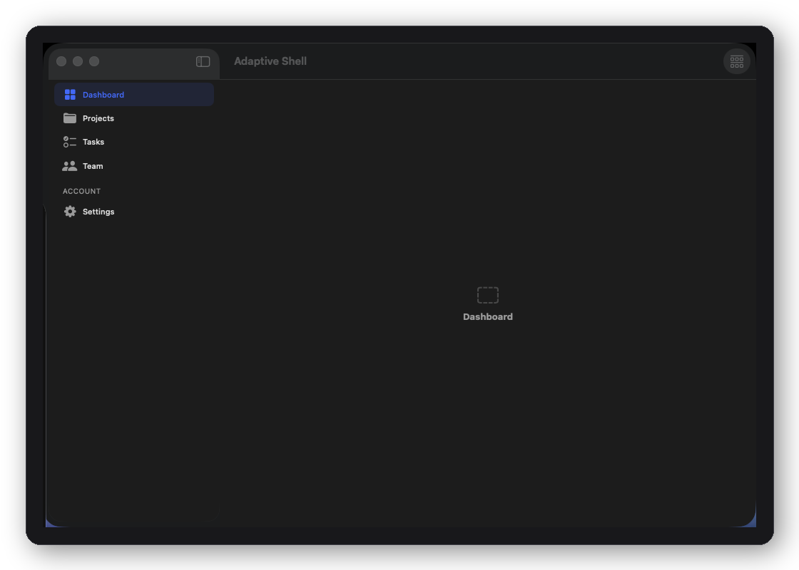
  • DFAdaptiveShell — tab bar on iPhone, sidebar on iPad/Mac
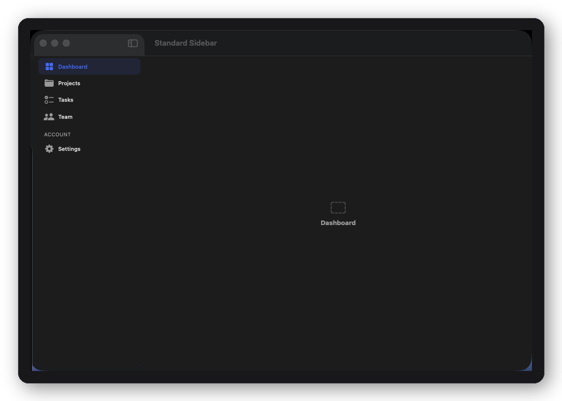
  • DFStandardSidebarShell — collapsible sections sidebar
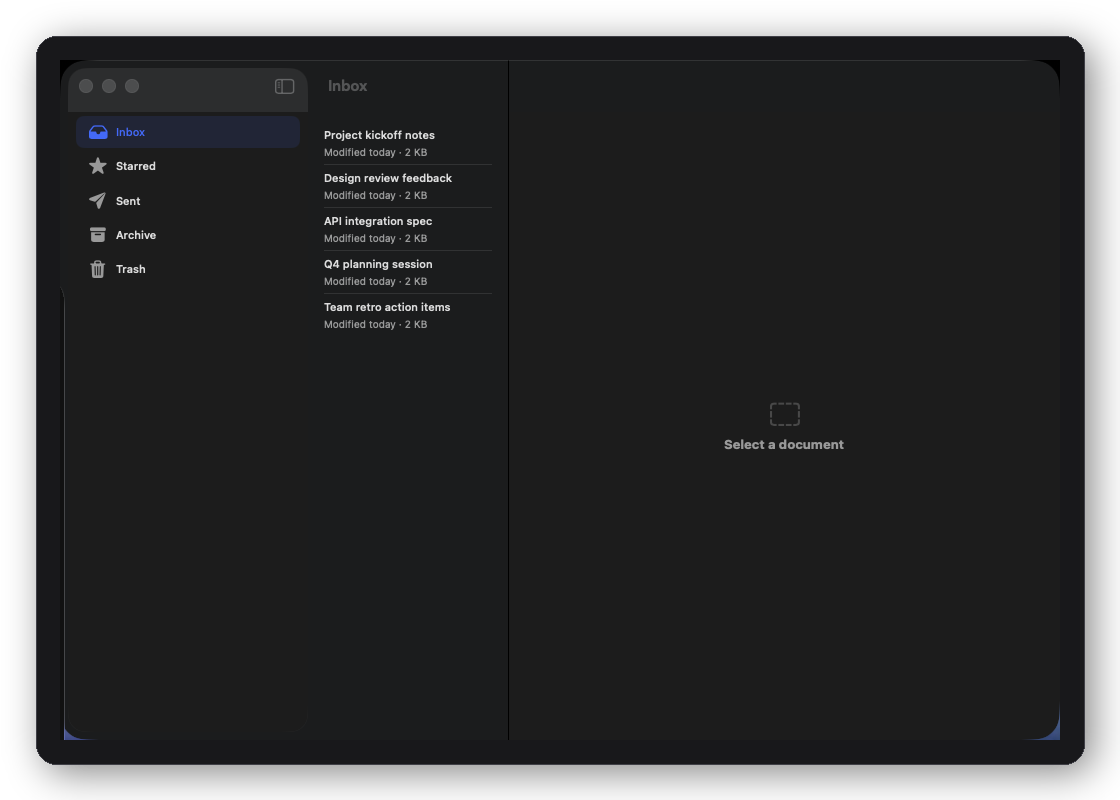
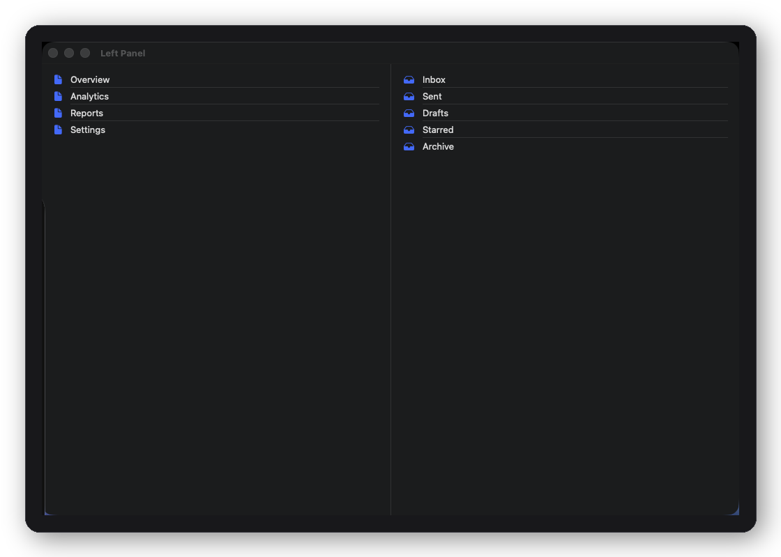
  • DFThreeColumnShell — sidebar + list + detail split view
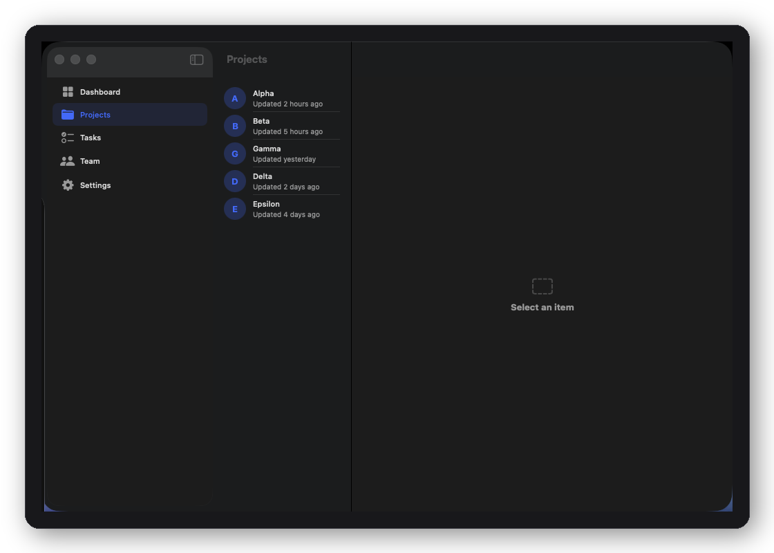
  • DFDualSidebarShell — nested dual navigation
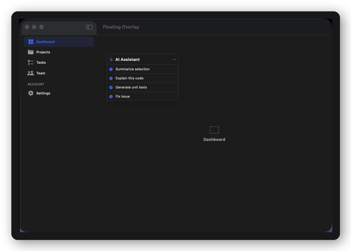
  • DFFloatingOverlayShell — overlay panel on compact layout
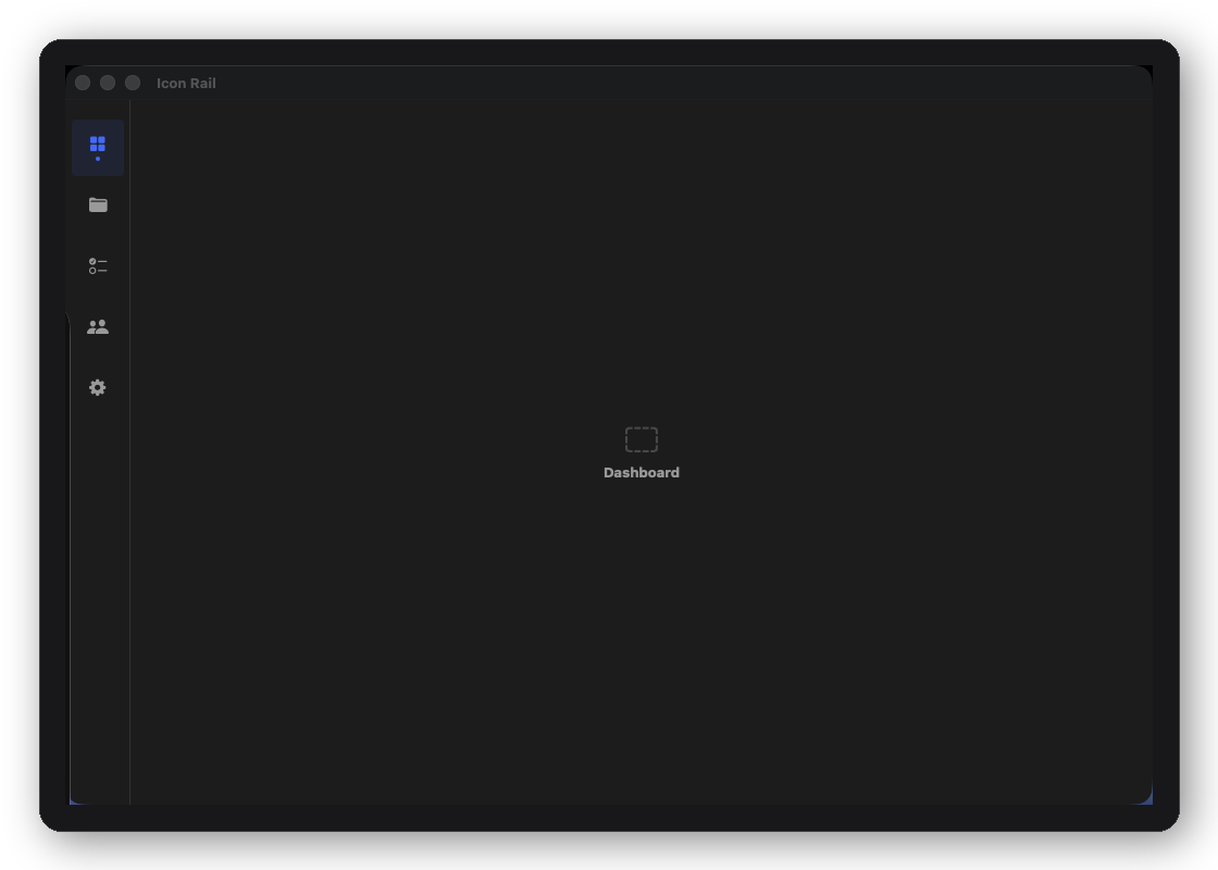
  • DFIconRailShell — icon-only compact rail
  • + 12 more patterns (search, calendar, file tree, inspector…)

30 drop-in blocks

Each block accepts a typed Configuration struct and inherits every visual token from your active DFTheme automatically.
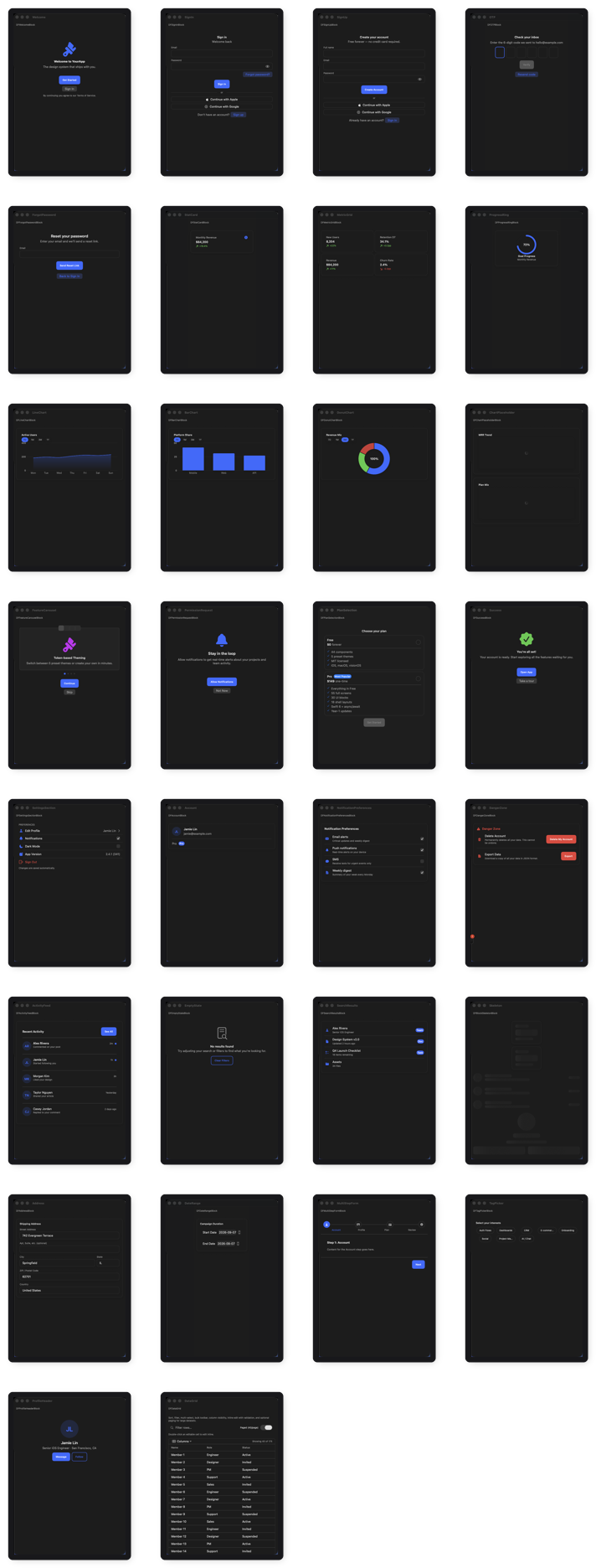
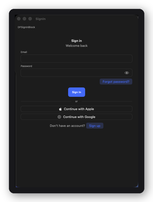
A strip of DesignFoundation Pro UI blocks — sign-in, stat cards, charts, and plan selection
Auth
DFSignInBlock — email, password, and social sign-in
DFSignInBlock
Email + password + social auth buttons with optional sign-up prompt
DFWelcomeBlock
Logo, headline, tagline, and primary + social sign-in entry point
DFSignUpBlock
Name, email, password fields with social providers and terms prompt
DFForgotPasswordBlock
Email input, submit, and optional back link — ready to wire to any auth API
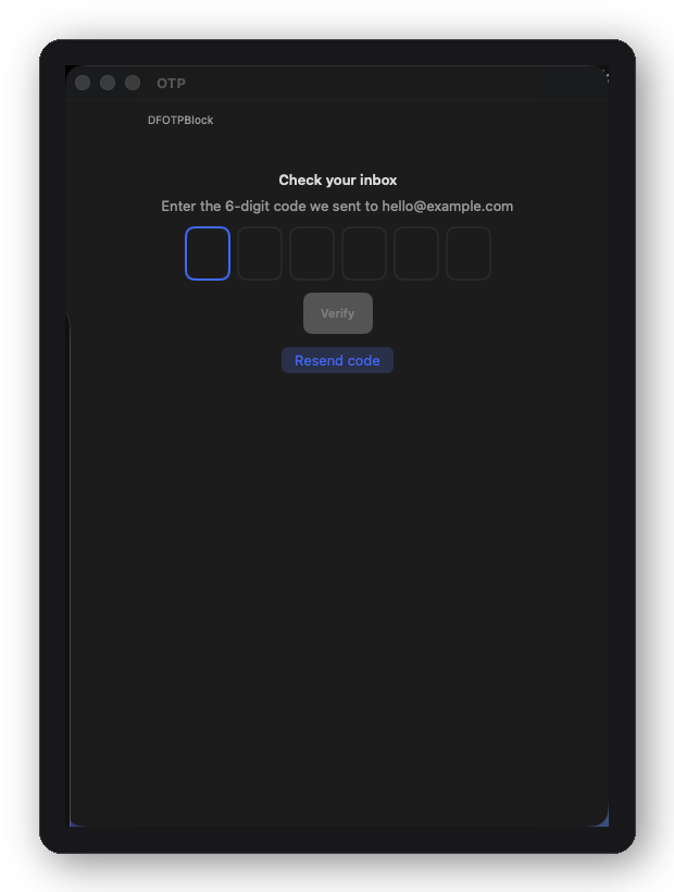
DFOTPBlock — one-time passcode entry with auto-advance
DFOTPBlock
N-digit code entry with auto-advance, paste support, and resend timer
Dashboard
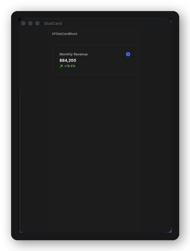
DFStatCardBlock — KPI card with trend and icon
DFStatCardBlock
KPI with value, trend direction, icon, and tap handler
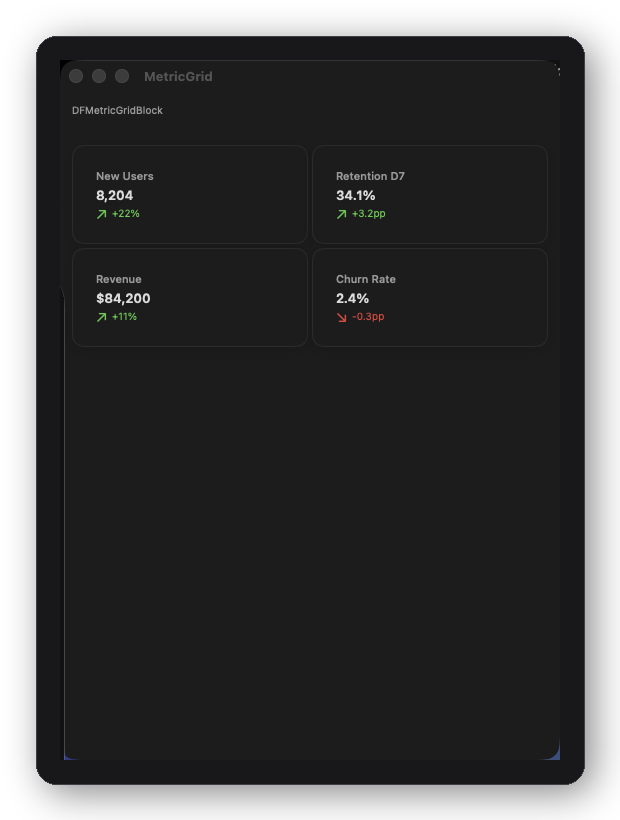
DFMetricGridBlock — grid of labeled metric values
DFMetricGridBlock
2- or 3-column grid of labeled metric values with optional icons
DFProgressRingBlock
Circular progress ring with center label, legend, and animated fill
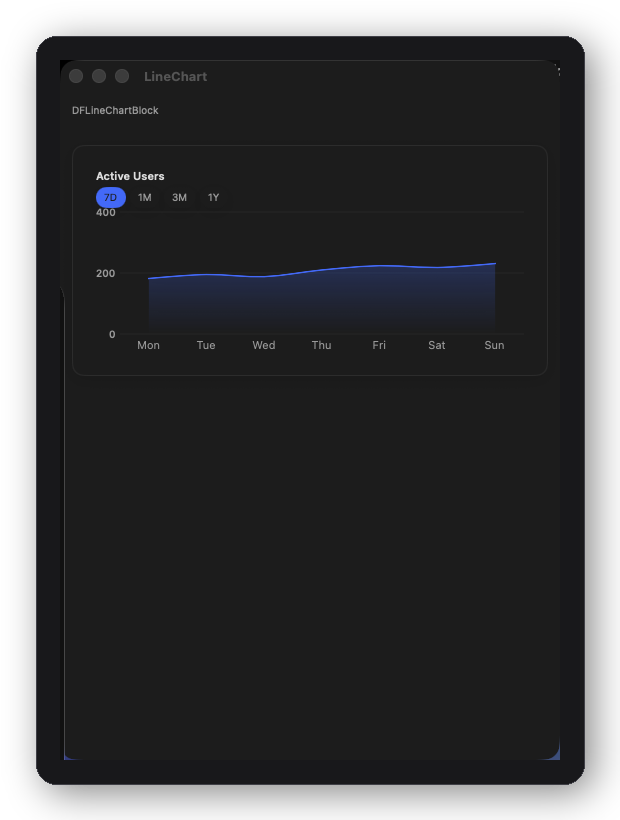
DFLineChartBlock — Swift Charts line and area trend
DFLineChartBlock
Swift Charts line + area trend with period toolbar, theming, and loading skeleton
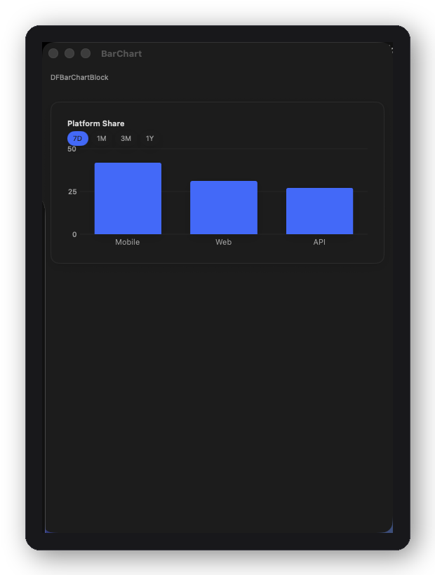
DFBarChartBlock — Swift Charts vertical bar breakdown
DFBarChartBlock
Swift Charts vertical bar breakdown with themed bars and period selection
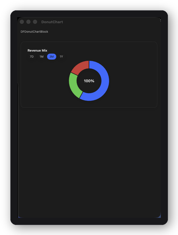
DFDonutChartBlock — Swift Charts donut with segment coloring
DFDonutChartBlock
Swift Charts donut with segment coloring, center label, legend, and period toolbar
DFChartPlaceholderBlock
Shimmer skeleton slot while chart data loads — swap for a real chart block when ready

All three chart blocks are built on DFChartBlockShell<Period, Chart> — the shared card/title/loading/period-toolbar chrome around any Swift Charts view. Use it directly for a chart shape none of the three cover, or conform to DFChartBlock to compose the same way. Their periods: field accepts the built-in DFChartPeriodPreset (7D/1M/3M/1Y) or your own type conforming to DFChartPeriodRepresentable.

Onboarding
DFFeatureCarouselBlock
Paginated feature highlights with icon, title, body, and skip/continue controls
DFPermissionRequestBlock
System permission prompt with icon, explanation, allow/skip actions
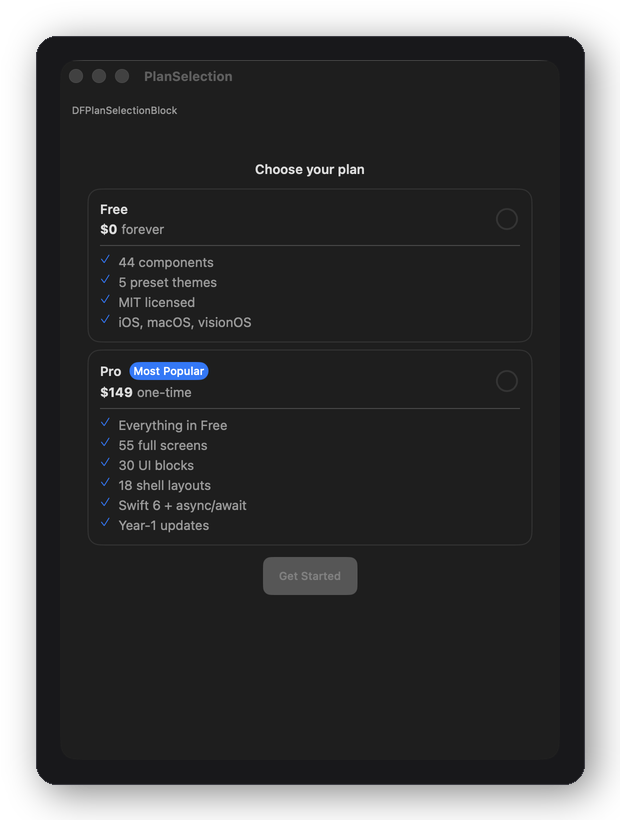
DFPlanSelectionBlock — pricing plan cards with recommended plan
DFPlanSelectionBlock
Pricing plan cards with feature lists and highlighted recommended plan
DFSuccessBlock
Completion screen with icon, headline, message, and primary CTA
Settings
DFSettingsSectionBlock
Grouped settings rows — navigation, toggle, destructive, and info variants
DFAccountBlock
Avatar, display name, email, edit action, and optional membership badge
DFNotificationPreferencesBlock
Per-channel notification toggles with section grouping
DFDangerZoneBlock
Destructive actions list with confirmation prompt and red styling
Forms
DFTagPickerBlock
Multi-select pill picker with optional max selection and custom tags
DFDateRangeBlock
Start + end date pickers with validation and range constraint support
DFAddressBlock
Street, city, state, zip, country fields with keyboard-aware layout
DFMultiStepFormBlock
Stepped form container with progress bar, back/next nav, and completion callback
Feed · People · Lists · Loading · Empty State
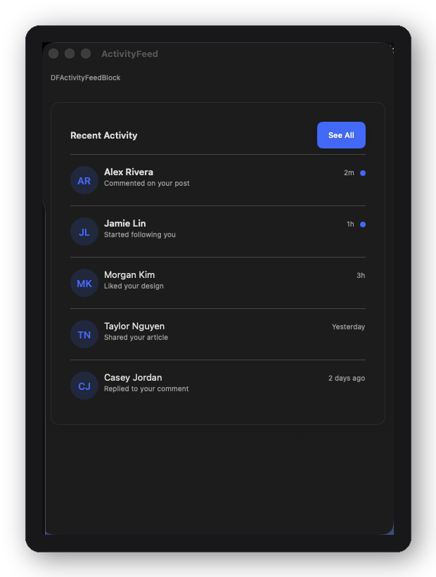
DFActivityFeedBlock — scrollable activity feed with section headers
DFActivityFeedBlock
Full scrollable activity feed with section headers and empty state
DFProfileHeaderBlock
Large avatar, name, subtitle, primary + secondary actions
DFSearchResultsBlock
Search results list with section grouping, badges, and empty/loading states
DFBlockSkeletonBlock
Animated skeleton placeholder matching any block's layout
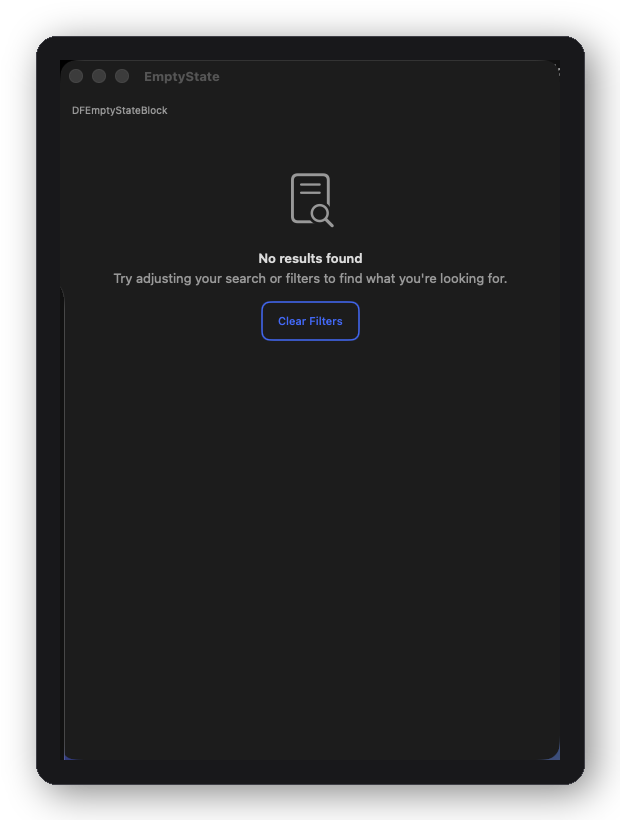
DFEmptyStateBlock — icon, headline, message, and CTA
DFEmptyStateBlock
Icon, headline, optional message, optional CTA button
Social
DFCommentThreadBlock
Nested comment/reply thread with one level of indentation — drop into a post-detail screen or anywhere a threaded discussion is needed
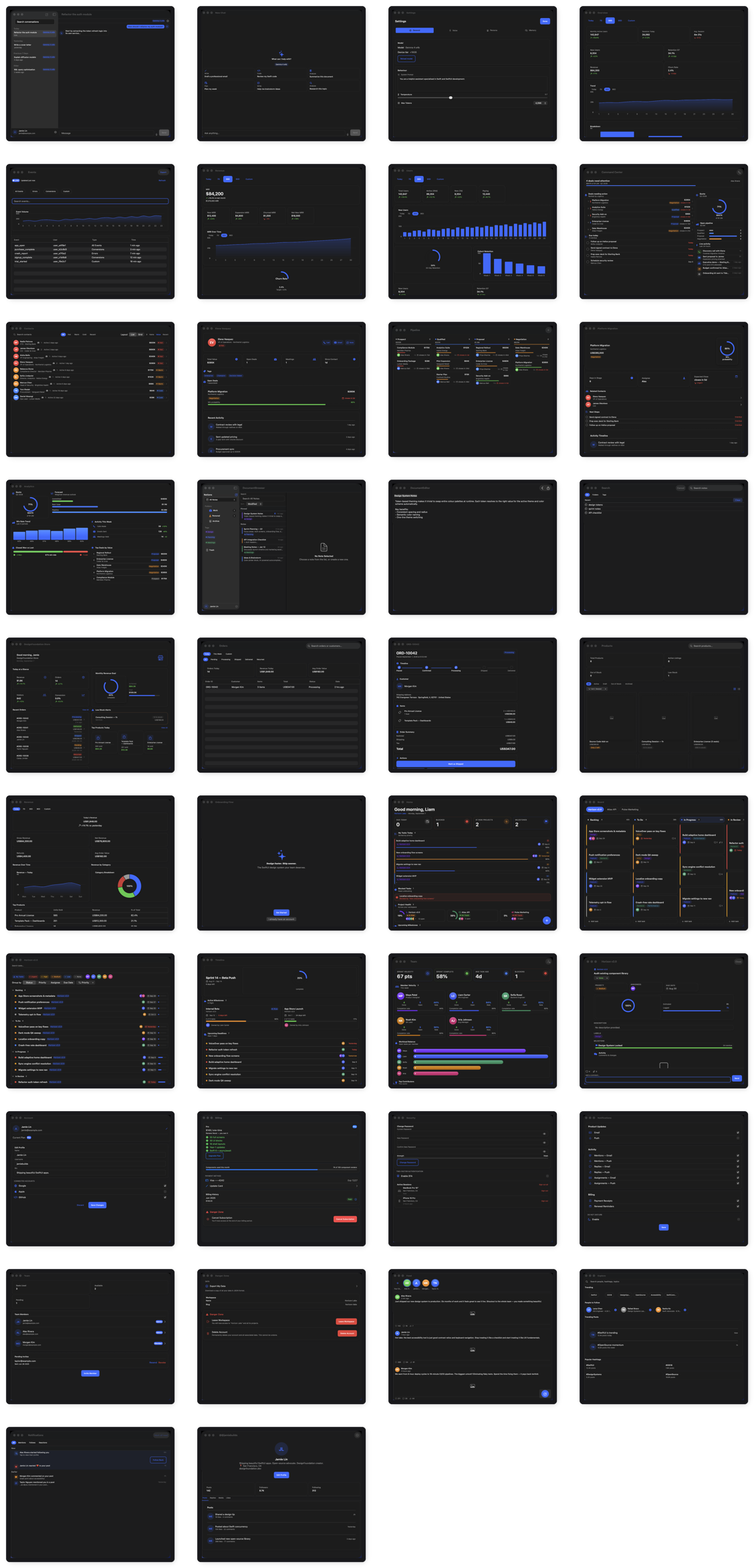
55 screens. 12 complete verticals.

Each vertical is a self-contained set of full-page SwiftUI screens covering a complete feature domain — domain models, typed configuration, and @MainActor-isolated action closures included.

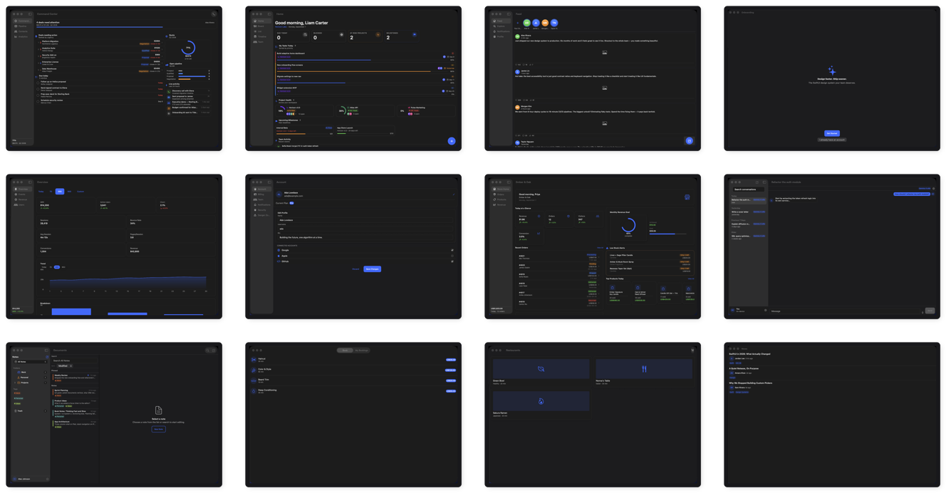
A strip of DesignFoundation Pro screens across verticals
AI Chat
Available
Full-featured AI assistant UI — thread management, model selection, streaming, side-by-side model comparison.
  • DFAIChatThreadScreen
  • DFAIChatNewScreen
  • DFAIChatCompareScreen
  • DFAIChatSettingsSheet

Also ships DFAIThinkingView (a staggered-dot "model is thinking" indicator) and DFAISummaryCard (a themed AI-generated summary card with headline, body, and key points) for building your own chat UI around the screens.

Analytics
Available
Product analytics dashboard — KPI overview, revenue tracking, user acquisition, and a live event feed.
  • DFAnalyticsOverviewScreen
  • DFAnalyticsRevenueScreen
  • DFAnalyticsUsersScreen
  • DFAnalyticsEventsScreen
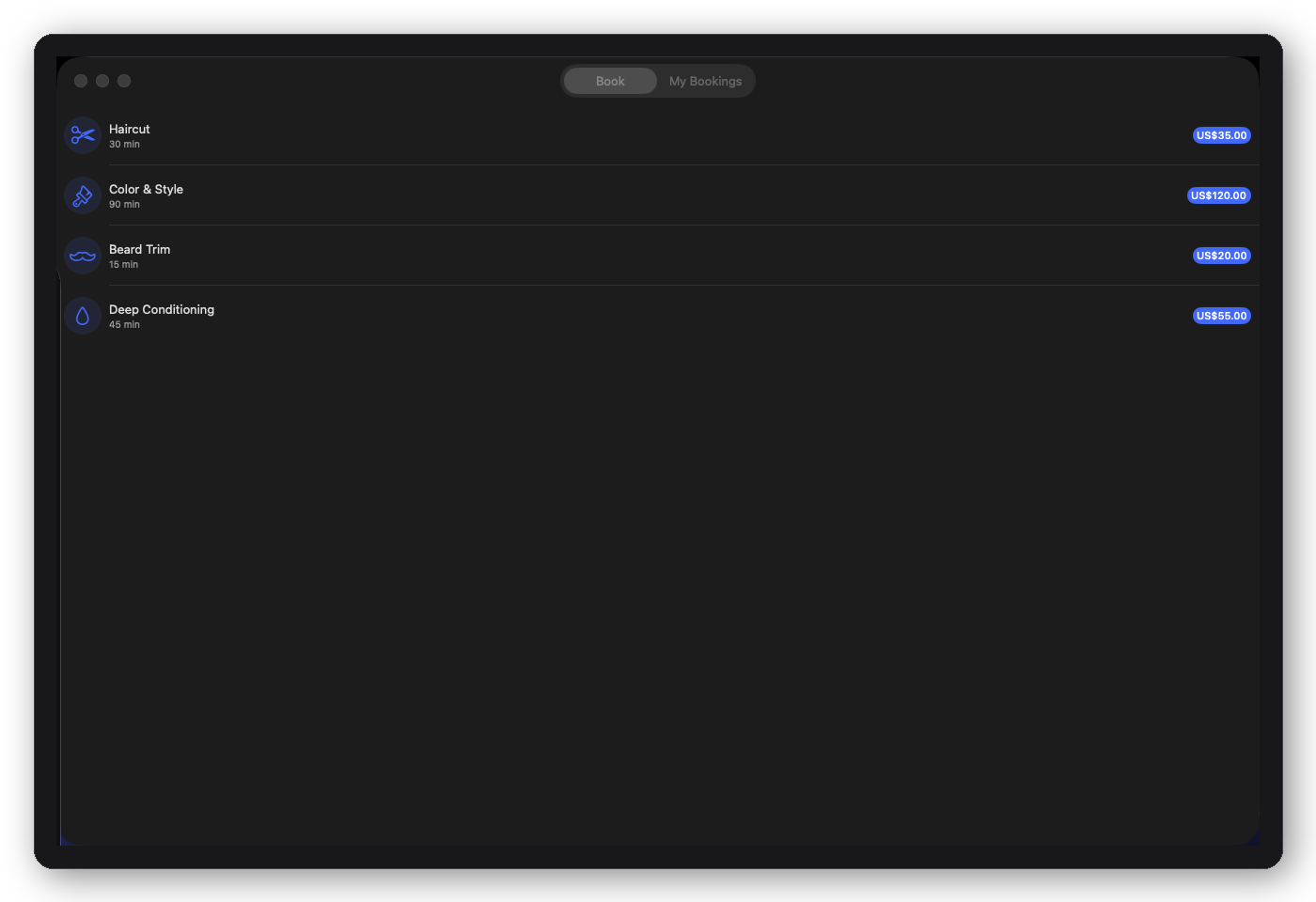
DFBookingRootView — service selection, schedule, and confirmation flow
Booking
Available
Appointment booking, done — service selection, time slot picker, confirmation, and a "My Bookings" screen for what's already scheduled. Built for salons, clinics, consultants, and fitness studios.
  • DFBookingServiceSelectionScreen
  • DFBookingScheduleScreen
  • DFBookingConfirmationScreen
  • DFMyBookingsScreen
CRM
Available
Sales command center — deals, contacts, pipeline, and quota analytics for relationship-driven apps.
  • DFCRMHomeScreen
  • DFCRMContactsScreen
  • DFCRMContactDetailScreen
  • DFCRMPipelineScreen
  • DFCRMDealDetailScreen
  • DFCRMAnalyticsScreen
Documents
Available
Notes and document management — folder browser, rich text editor with toolbar, full-text search.
  • DFDocumentBrowserScreen
  • DFDocumentEditorScreen
  • DFDocumentSearchScreen
E-commerce
Available
Store management — storefront home, product catalog, order management, and revenue analytics.
  • DFEcommerceStoreHomeScreen
  • DFEcommerceProductsScreen
  • DFEcommerceOrdersScreen
  • DFEcommerceOrderDetailScreen
  • DFEcommerceRevenueScreen
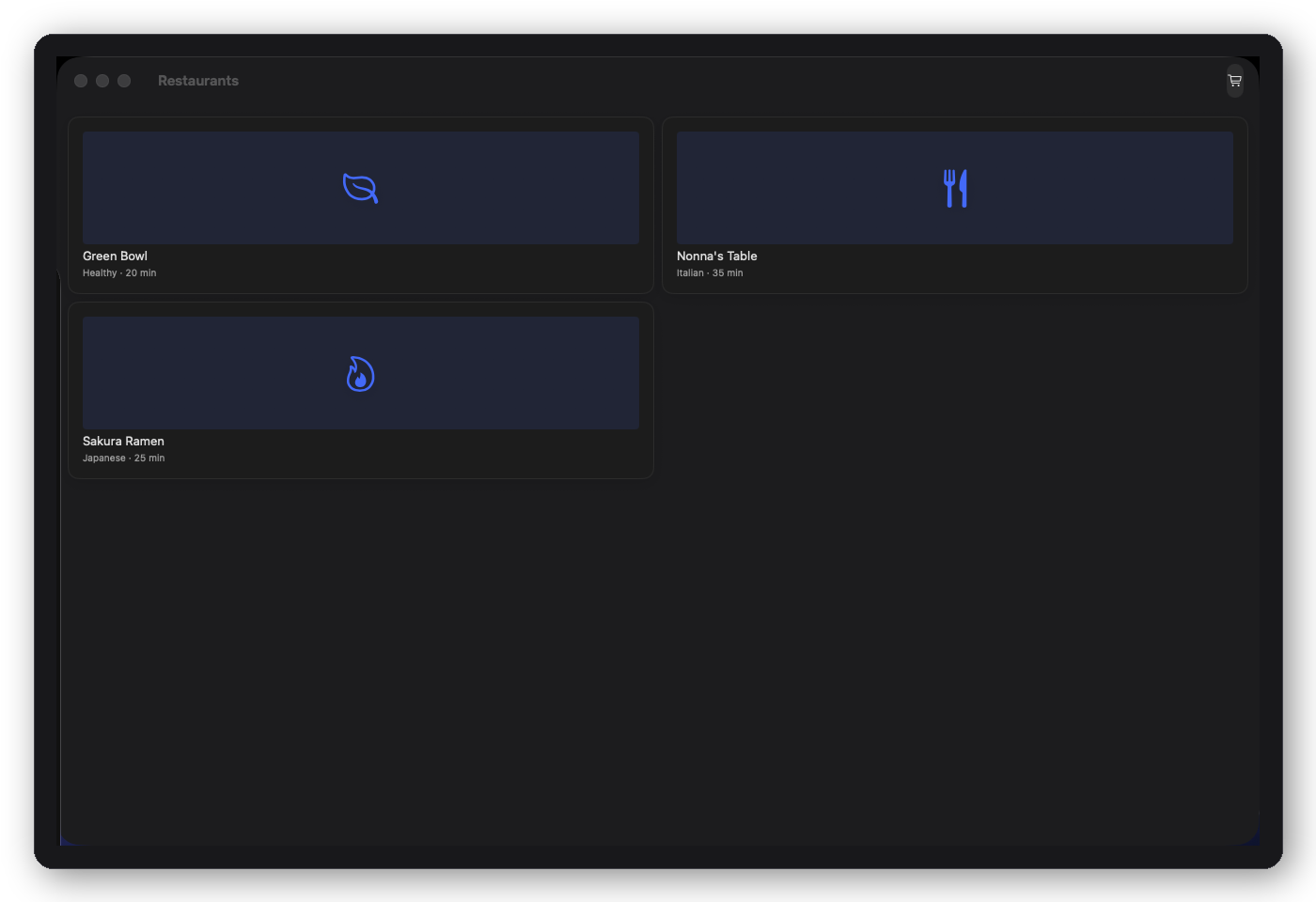
DFFoodRootView — restaurant home, menu, and item detail
Food
Available
Restaurant browsing to order-ready item detail in three screens. Built for food delivery, restaurant, and ordering apps.
  • DFFoodHomeScreen
  • DFFoodRestaurantDetailScreen
  • DFFoodItemDetailScreen
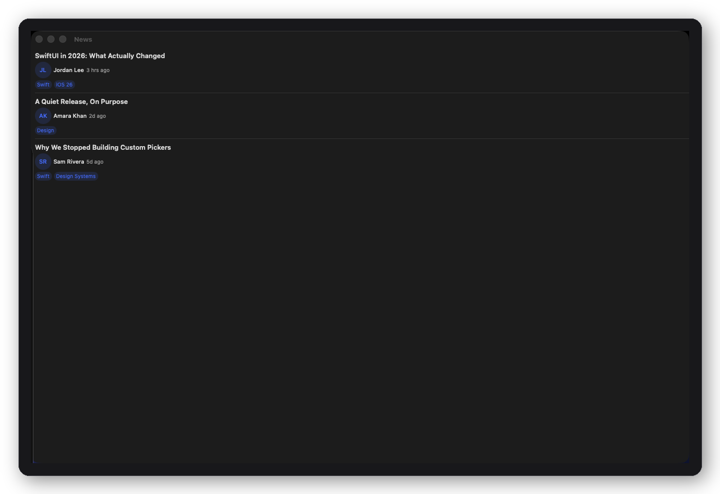
DFNewsRootView — article list and detail
News
Available
A clean article list pushing to a full-article reading view — built on the free package's article primitives. For content, publishing, and media apps.
  • DFNewsListScreen
  • DFNewsDetailScreen
Onboarding
Available
Complete 10-screen first-run flow — from welcome and auth through permissions, personalisation, and plan selection.
  • DFOnboardingWelcomeScreen
  • DFOnboardingSignInScreen
  • DFOnboardingSignUpScreen
  • DFOnboardingOTPScreen
  • DFOnboardingFeaturesScreen
  • DFOnboardingPermissionsScreen
  • DFOnboardingProfileScreen
  • DFOnboardingPersonalisationScreen
  • DFOnboardingPlanScreen
  • DFOnboardingSuccessScreen
Project Manager
Available
Team project tracking — command center, kanban board, list view, Gantt-style timeline, team roster, and task detail.
  • DFPMHomeScreen
  • DFPMBoardScreen
  • DFPMListScreen
  • DFPMTimelineScreen
  • DFPMTeamScreen
  • DFPMTaskDetailScreen
Settings
Available
Full app settings suite — account management, billing and invoices, security and 2FA, notifications, team management, and danger zone.
  • DFSettingsAccountScreen
  • DFSettingsBillingScreen
  • DFSettingsSecurityScreen
  • DFSettingsNotificationsScreen
  • DFSettingsTeamScreen
  • DFSettingsDangerZoneScreen
Social
Available
Social feed app — story rail + post feed, search and discover, user profiles with follow/own modes, notification center.
  • DFSocialFeedScreen
  • DFSocialExploreScreen
  • DFSocialProfileScreen
  • DFSocialNotificationsScreen

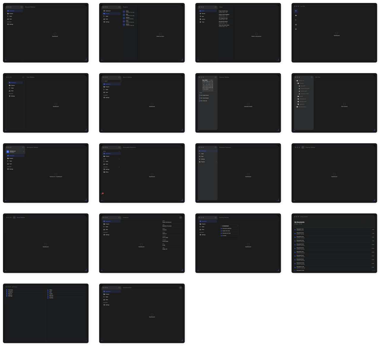
18 navigation shells

Navigation-level container views that handle sidebar / tab bar / split view logic. Drop your content in — the shell adapts to the device and size class automatically. Works with any content, any theme.

A strip of DesignFoundation Pro navigation shell layouts
DFAdaptiveShell layout
DFAdaptiveShell
Tab bar on iPhone, sidebar on iPad/Mac — auto-switching
DFStandardSidebarShell layout
DFStandardSidebarShell
Collapsible section groups, navigation-split-view backed
DFThreeColumnShell layout
DFThreeColumnShell
Sidebar + list + detail — classic iPad/Mac split layout
DFDualSidebarShell layout
DFDualSidebarShell
Nested dual-column navigation for hierarchical content
DFFloatingOverlayShell layout
DFFloatingOverlayShell
Overlay panel slides over content — compact drawer pattern
DFIconRailShell layout
DFIconRailShell
Compact icon-only left rail — VS Code / Slack style
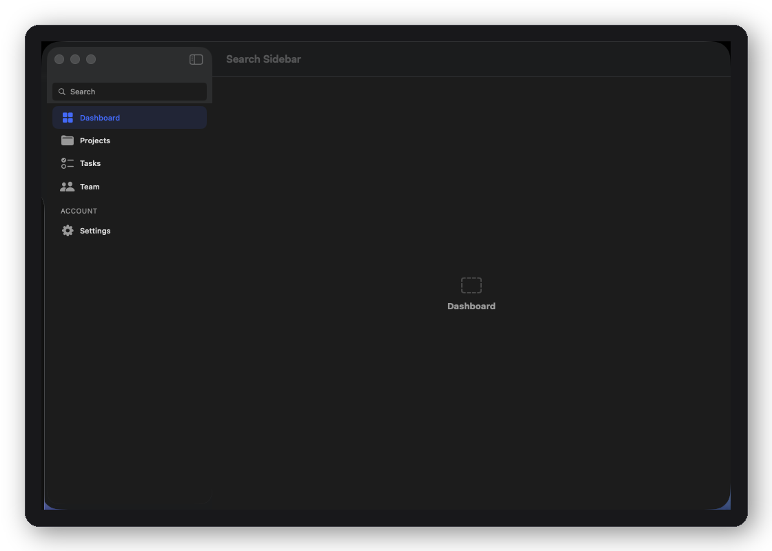
DFSearchSidebarShell layout
DFSearchSidebarShell
Sidebar with integrated search field and filtered nav
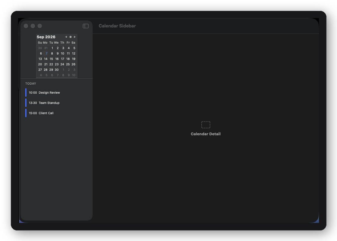
DFCalendarSidebarShell layout
DFCalendarSidebarShell
Mini calendar in sidebar — date-driven content navigation
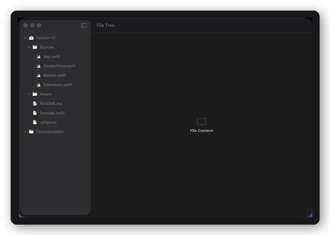
DFFileTreeShell layout
DFFileTreeShell
Expandable file-tree sidebar — Finder / Xcode Navigator style
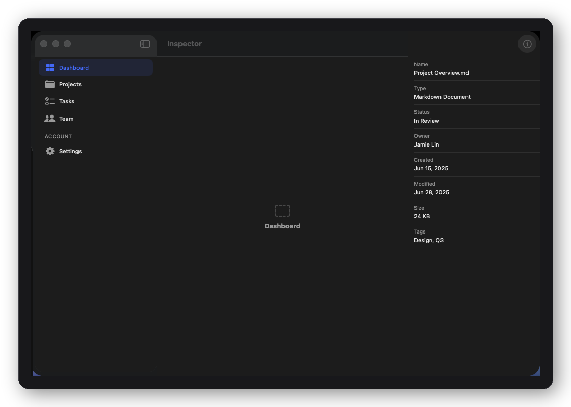
DFRightInspectorShell layout
DFRightInspectorShell
Main content + trailing inspector panel — design-tool style
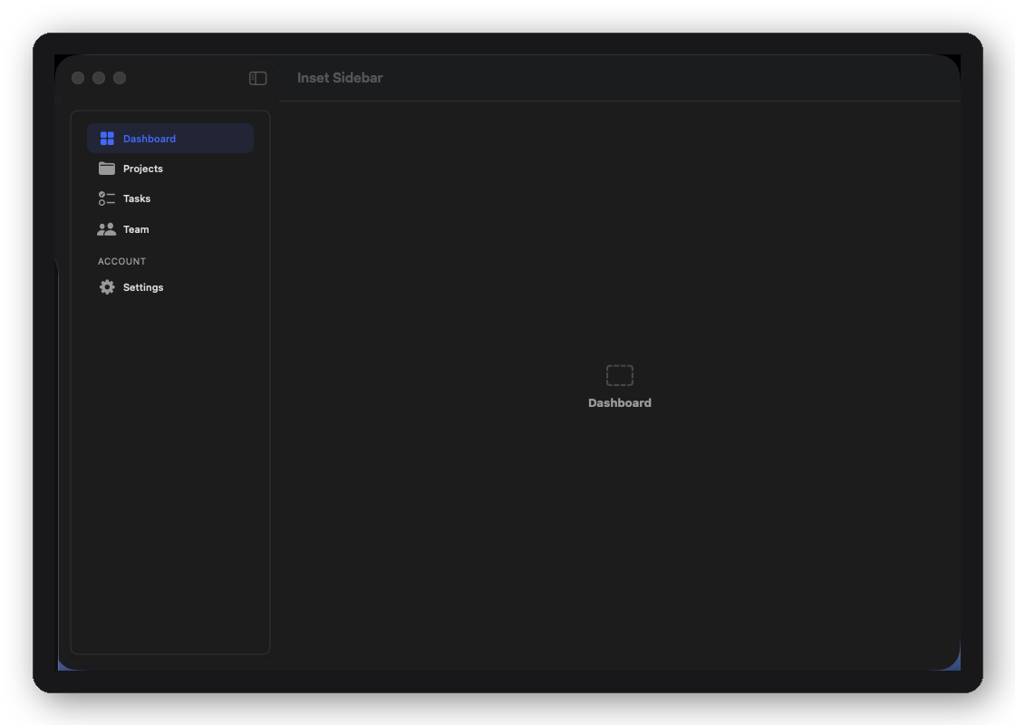
DFInsetSidebarShell layout
DFInsetSidebarShell
Inset sidebar with background separation and inner padding
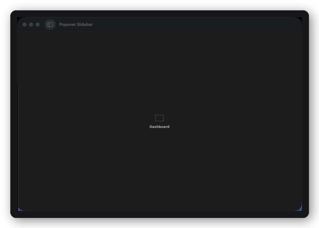
DFPopoverSidebarShell layout
DFPopoverSidebarShell
Sidebar items open inline popovers — Settings-app feel
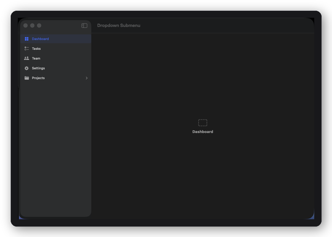
DFDropdownSubmenuShell layout
DFDropdownSubmenuShell
Nav items with dropdown submenus for nested sections
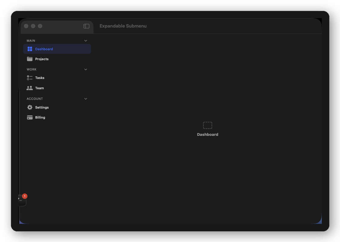
DFExpandableSubmenuShell layout
DFExpandableSubmenuShell
Accordion-style expanding subnav sections
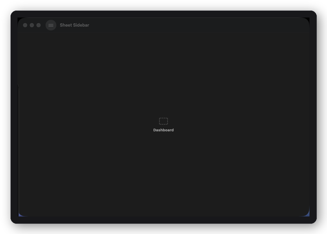
DFSheetSidebarShell layout
DFSheetSidebarShell
Navigation presented as a bottom sheet on compact layouts
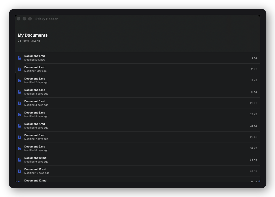
DFStickyHeaderShell layout
DFStickyHeaderShell
Content with a collapsing sticky header — profile / product page
DFNestedDualColumnShell layout
DFNestedDualColumnShell
Nested split view with independent leading and trailing nav
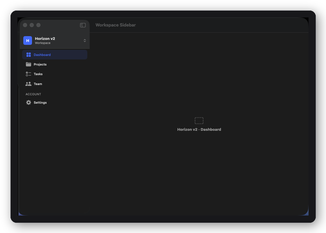
DFWorkspaceSidebarShell layout
DFWorkspaceSidebarShell
Workspace-style sidebar with user account switcher at bottom

E-commerce — five screens, full workflow.

From your store home through browsing products, managing orders, and reviewing revenue — every screen shares a typed model layer and connects through closures your view model already speaks.

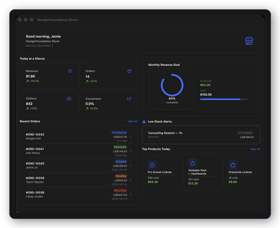
DFEcommerceStoreHomeScreen — KPI strip and activity feed
Store Home
KPI strip, recent activity feed, and quick-action navigation hub.
Products
Grid/list toggle, status filter, sort menu, inventory metrics, stock indicators.
Orders
Searchable order list with status chips, date-range filter, and loading/empty states.
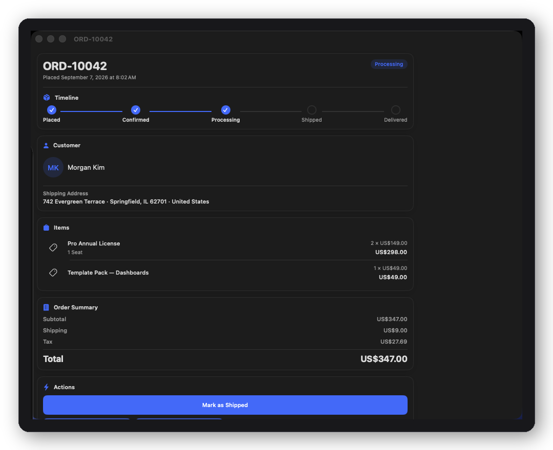
DFEcommerceOrderDetailScreen — line items and fulfillment timeline
Order Detail
Line items, fulfillment timeline, tracking info, and cancel/ship actions.
Revenue
Period selector, hero revenue tile, stat cards, top products table, monthly progress ring.
// Wire up an orders screen in three lines.
NavigationStack {
    DFEcommerceOrdersScreen(
        configuration: .init(
            orders: viewModel.orders,
            onSelectOrder: { order in path.append(order) },
            onMarkShipped: { order in viewModel.markShipped(order) }
        )
    )
}

Built to the same standard as the primitives.

Every block, screen, and shell ships with non-negotiable guarantees — not aspirational, contractual.

  • Typed Configuration struct per block and screen — no stringly-typed API, no loose dictionaries, full autocomplete
  • All visual tokens from DFTheme — zero hardcoded colors, radii, fonts, or shadows anywhere
  • Swift 6 strict concurrency — compiles clean with StrictConcurrency enabled, no suppressions
  • Accessibility wired by default — labels, traits, and focus order on every interactive element
  • Light and dark #Preview variants included for every block, screen, and shell
  • No external dependencies beyond DesignFoundation itself
  • Domain model layer per screen vertical — DFOrder, DFProduct, CRMContact, AIChatMessage, etc.
  • @MainActor-isolated action closures — safe to call directly into your actor-isolated view model
  • Cross-platform by default — platform adaptation handled internally; no #if os() guards required in consuming code
  • iOS 18 · macOS 15 · visionOS 2

The dependency chain

Two packages. A clean stack. DesignFoundation is free and open-source — Pro adds everything on top.

Package What it provides License Requires
DesignFoundation Theme engine, 44 components + 12 presentation and layout modifiers, preset themes, Liquid Glass, full style system MIT — free —
DesignFoundationPro 30 UI blocks + 55 screens across 12 verticals + 18 shell layouts + 12 composition examples + advanced popups (unified overlay/sheet/window presentation, scroll popup, priority queue, celebration, permission, rating, input, consent and action popups, undo and progress toasts, notification banners, live capsule, coachmark tours, motion presets) Commercial DesignFoundation

12 wired app examples. Steal or ship.

Each composition example is a complete, runnable SwiftUI app built entirely from Pro blocks, screens, and shells — themed, wired with dfToast, and written to production quality. Copy the whole thing or take just the parts you need.

A strip of DesignFoundation Pro composition examples — fully wired reference apps
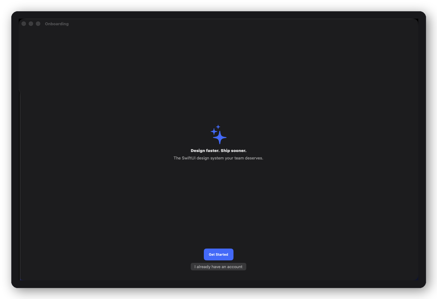
DFOnboardingFlow composition example
Onboarding
Full 10-screen first-run flow with auth, plan selection, and personalisation
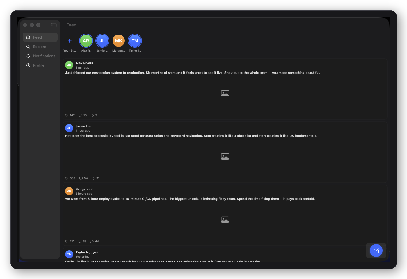
DFSocialAppShell composition example
Social
Feed, explore, notifications, and profile via DFSocialAppShell
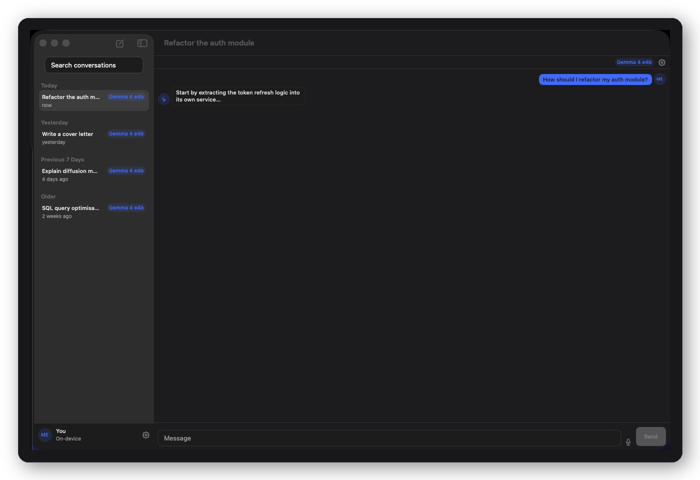
DFAIChatRootView composition example
AI Chat
Thread view, new chat, model compare, settings — DFAIChatRootView
DFDocumentsRootView composition example
Documents
Browser, editor, search — three-column shell, knowledge-app pattern
DFSettingsRootView composition example
Settings
All six settings screens in a unified root — universal for any app
DFCRMRootView composition example
CRM
Pipeline, contacts, deals, and analytics — sales command center reference
DFPMRootView composition example
Project Manager
Board, list, timeline, and team — task-tracking app reference
DFEcommerceRootView composition example
E-commerce
Store home, products, orders, revenue — seller ops reference
DFAnalyticsRootView composition example
Analytics
Overview, revenue, users, events — metrics dashboard reference
DFBookingRootView composition example
Booking
Service selection, schedule, confirmation, and My Bookings — DFBookingRootView
DFFoodRootView composition example
Food
Restaurant browsing to item detail — DFFoodRootView
DFNewsRootView composition example
News
Article list to full-article reading view — DFNewsRootView

See The Foundation Way for side-by-side line counts — how much code stays out of your repo (and out of AI prompts). All 12 examples are in DFPlayground.


A complete popup system.

DesignFoundation's free .dfPopup engine covers cards, toasts, floaters and sheets. Pro layers a complete popup system on top of it: a unified presentation API, dismiss reasons, keyboard and scrim control, motion presets, a priority queue, scroll popups, and a set of finished rich popups. Card-style rich popups are built on the free DFPopupCard and follow the environment DFPopupStyle. New in Pro 2.3.0, which requires DesignFoundation 1.7.1 or later. Every clip is a real recording.

Hover a tile (or tap it) to play the real recording. Recorded from the DFPlayground Popup Lab running on iOS 26 (light/dark, DesignFoundation presets).

APIWhat it does
.dfPopupPresentation(isPresented:display:configuration:keyboard:scrim:motion:pausesOnHold:chrome:haptic:onDismiss:content:)One API, three display modes (.overlay, .sheet, .window).
DFPopupScrim, DFPopupMotion, DFPopupDismissReasonScrim, motion and dismissal vocabulary shared by every Pro presenter.
.dfScrollPopup(...)Scrollable popup with detents, side sheets, header styles and a pinned footer.
DFPopupCenter + .dfPopupCenter(_:)Priority queue with preemption and id de-duplication.
.dfCelebrationPopup .dfPermissionPrompt .dfPromoPopup .dfRatingPrompt .dfInputPopup .dfConsentSheet .dfActionPopupFinished popups, each a public view plus a presenting modifier.
.dfUndoToast .dfProgressToast .dfNotificationBanners .dfLiveCapsuleToasts and live status.
DFCoachmarkTour + .dfCoachmarkTour(_:) .dfCoachmark .dfPopupAnchor(_:)Spotlight coachmarks over marked targets.
DFPopupCountdownBar DFPopupCountdownRing DFPopupHapticCountdown indicators and tactile cues.

Presentation modes, keyboard and scrims

dfPopupPresentation presents a popup in one of three modes: .overlay (default), .sheet (a real SwiftUI sheet for bottom-anchored popups, a full-screen cover for the rest, binding kept in sync both ways) or .window (a transparent UIWindow on iOS above sheets and navigation bars; a borderless child NSPanel on macOS; an overlay on visionOS). keyboard: .avoid (default) lifts the popup above the software keyboard. DFPopupScrim is .dim(_:), .blur(_:), .custom { } or .clear; .passingTouches() keeps a visible scrim from blocking the app. dfPopupWindow remains as shorthand for display: .window.

YourContentView().dfPopupPresentation(
    isPresented: $showPopup,
    display: .window,                        // .overlay (default) | .sheet | .window
    configuration: .floater(position: .top),
    keyboard: .avoid,                        // .avoid (default) | .ignore
    scrim: .blur(0.7),                       // .dim(0.3) | .blur(_:) | .custom { } | .clear
    motion: .zoom,
    pausesOnHold: true,
    chrome: .style,                          // .style wraps content in DFPopupStyle; .none draws it as-is
    haptic: .success,
    onDismiss: { reason in print(reason) }
) {
    Text("Hello")
}
// A visible scrim that lets touches reach the app
YourContentView().dfPopupPresentation(isPresented: $showPopup, scrim: .dim(0.2).passingTouches()) {
    Text("Non-blocking")
}

// Shorthand for display: .window
YourContentView().dfPopupWindow(isPresented: $showPopup, configuration: .toast(position: .top)) {
    Text("Above the sheet")
}
Window popup presented above a sheet, then a window toast (Aurora light).
Blur scrim with keyboard avoidance: the popup rises above the keyboard (Copper light).

Recorded from the DFPlayground Popup Lab running on iOS 26 (light/dark, DesignFoundation presets).

Dismiss reasons, pause on hold and countdown

The Pro presenters (dfPopupPresentation, dfScrollPopup, DFPopupCenter.present and the rich popups and toasts below, except the live capsule, coachmarks and notification banners) deliver a DFPopupDismissReason (.timeout .tap .outsideTap .drag .programmatic .preempted) to onDismiss. dfPopupWindow keeps a plain () -> Void onDismiss, and notification banners report (item, reason). Content can close its own popup through @Environment(\.dfPopupDismiss). Resting a finger or pointer on an auto-dismissing popup pauses its timer. DFPopupCountdownBar and DFPopupCountdownRing follow the popup's live, pausable countdown.

struct CloseButton: View {
    @Environment(\.dfPopupDismiss) private var dismiss     // no-op outside a Pro popup
    @Environment(\.dfPopupCountdown) private var countdown // the auto-dismiss timer, if any

    var body: some View {
        VStack {
            DFPopupCountdownBar()
            Button("Done") { dismiss(.tap) }
        }
    }
}
YourContentView().dfPopupPresentation(
    isPresented: $showPopup,
    configuration: .floater(position: .bottom, autoDismissAfter: 5),
    pausesOnHold: true,
    onDismiss: { reason in
        if reason == .timeout { commitDelete() }
    }
) {
    HStack {
        DFPopupCountdownRing()
        Text("Message deleted")
    }
}
Press and hold freezes the auto-dismiss countdown (Aurora dark).
DFPopupCountdownBar and DFPopupCountdownRing following the popup's live countdown (Sage light).

Recorded from the DFPlayground Popup Lab running on iOS 26 (light/dark, DesignFoundation presets).

Scroll popup

dfScrollPopup is a popup with a pinned header, scrolling body and optional pinned footer. Dragging dismisses only when the content is at its top, so the drag and the scroll never fight. detents: (.medium .large .fraction .height) snap the height; edge: adds .leading/.trailing side sheets on regular width (compact falls back to the bottom); headerStyle: is .plain .centered .prominent .closable; fromTop: true presents from the top edge.

YourContentView().dfScrollPopup(
    isPresented: $showPopup,
    edge: .automatic,
    detents: [.medium, .large],
    headerStyle: .closable,
    scrim: .dim(),
    onDismiss: { reason in print(reason) }
) {
    Text("Release notes")
} content: {
    Text("Long, scrollable content…")
} footer: {
    Button("Update now") { }
}
YourContentView().dfScrollPopup(isPresented: $showPopup, fromTop: true) {
    Text("Ticket #4821")
} content: {
    Text("Comments…")
}
Scroll popup from the bottom: scroll the content, then drag to dismiss at the top (Aurora light).
Detents: drag up to grow to .large, drag down to shrink and dismiss (Sage light).
Scroll popup from the top edge: drag up to dismiss (Copper dark).
Prominent header style over a blur scrim (Garnet dark).

Recorded from the DFPlayground Popup Lab running on iOS 26 (light/dark, DesignFoundation presets).

Popup Center: priority queue

DFPopupCenter puts many popups behind one presenter. One shows at a time; the rest wait by DFPopupPriority (.low .normal .high .critical). A higher priority preempts the current popup (its onDismiss gets .preempted and it re-queues), and presenting an id that is already showing or waiting replaces it. The optional haptic plays when the popup takes over.

YourContentView().dfPopupCenter(popups)     // popups: @StateObject DFPopupCenter
popups.present(id: "offline", priority: .high, configuration: .toast(),
               haptic: .warning, onDismiss: { reason in print(reason) }) {
    VStack {
        Text("You're offline")
        DFPopupCountdownBar()
    }
}
popups.dismiss(id: "offline")
A critical popup preempts a low one; the low popup returns when it is done (Slate dark).
Presenting the same id again updates the popup in place (Sage light).
All four priorities queued at once, with the queue inspector (Copper light).

Recorded from the DFPlayground Popup Lab running on iOS 26 (light/dark, DesignFoundation presets).

Celebration

DFCelebrationPopup: a hero icon springs in and a DFConfettiBurst fires from it. With Reduce Motion it fades only. Nothing needs image assets: everything is SF Symbols and theme gradients.

YourContentView().dfCelebrationPopup(
    isPresented: $showPopup,
    title: "Order placed!",
    message: "Tracking is on its way.",
    actionTitle: "Continue"
)
Celebration popup with a confetti burst (Aurora light).
Celebration popup, Garnet dark.

Recorded from the DFPlayground Popup Lab running on iOS 26 (light/dark, DesignFoundation presets).

Permission, promo, rating, input, consent and action popups

Each is a public view plus a presenting modifier. The celebration, permission, promo, rating, input, consent and action popups and the undo and progress toasts accept display: and a reason-style onDismiss:; the live capsule accepts display: but has no onDismiss; coachmarks and notification banners have neither display: nor the reason-style onDismiss (banners report (item, reason)). The card-style ones follow the environment DFPopupStyle. Permission prompt: pre-permission priming; you trigger the system prompt in onAllow. Promo: media area (.symbol, .gradient, .image), badge and CTA. Rating: stars, then a feedback step below the threshold or a review nudge at or above it. Input: validated, keyboard-aware, auto-focused. Consent: a sheet of toggleable categories. Action: rows with normal, destructive and cancel roles, centered, as a bottom sheet, or anchored to a view.

YourContentView().dfPermissionPrompt(isPresented: $showPopup, kind: .notifications,
                                     onAllow: { /* trigger the system prompt */ }, onDecline: { })

YourContentView().dfPermissionPrompt(
    isPresented: $showPopup, icon: "heart.fill", title: "Health data", message: "Why we ask",
    benefits: [DFPermissionBenefit(icon: "figure.walk", title: "Track steps", detail: "Stays on device")],
    onAllow: { }
)
YourContentView().dfPromoPopup(
    isPresented: $showPopup, badge: "New", media: .symbol("sparkles"),
    title: "Meet Focus mode", message: "Silence the noise.",
    actionTitle: "Try it", secondaryTitle: "Later", onAction: { }
)

YourContentView().dfRatingPrompt(
    isPresented: $showPopup, appName: "Orbit", threshold: 4,
    onSubmit: { stars, feedback in }, onRequestReview: { }
)
YourContentView().dfInputPopup(
    isPresented: $showPopup, title: "Rename folder", initialText: "Projects",
    validators: [DFRequiredValidator(), DFMaxLengthValidator(maxLength: 40)],
    onSubmit: { name in }
)

YourContentView().dfConsentSheet(isPresented: $showPopup, categories: DFConsentCategory.standard,
                                 onSave: { enabledIDs in })
YourContentView().dfActionPopup(isPresented: $showPopup, title: "Photo", actions: [
    DFActionPopupItem("Share", systemImage: "square.and.arrow.up") { },
    DFActionPopupItem("Delete", systemImage: "trash", role: .destructive) { },
    DFActionPopupItem("Cancel", role: .cancel) { },
], anchor: .bottom)            // .center | .bottom | .target(id)
Permission prompt: tap Turn on notifications (Sage light).
Promo popup with a badge, media area and CTA (Garnet light).
Rating prompt: 2 stars, Submit, private feedback step, Skip (Aurora light).
Rating prompt: 5 stars, Submit, App Store review nudge (Copper dark).
Input popup: the keyboard rises, type a name, Save (Aurora dark).
Consent sheet: toggle categories, Save choices (Slate light).
Action popup, centered (Slate light).
Action popup as an action sheet from the bottom (Sage dark).

Recorded from the DFPlayground Popup Lab running on iOS 26 (light/dark, DesignFoundation presets).

Undo, progress, notification banners and live capsule

DFUndoToast: message plus Undo with a live countdown ring (or .bar); holding pauses it, and onExpire fires only on .timeout, so it is the place to commit the destructive action. DFProgressToast: the ring morphs from progress to a success check or failure cross, with Cancel while running and Retry on failure. DFNotificationBanner: push-style banners stacked with depth, newest in front, swipe up to dismiss. DFLiveCapsule: a Dynamic-Island-style pill that expands with matched geometry.

YourContentView().dfUndoToast(
    isPresented: $showPopup, message: "Photo deleted", duration: 5, indicator: .ring,
    onUndo: { }, onExpire: { }
)

YourContentView().dfProgressToast(
    isPresented: $showPopup, state: uploadState, title: "Uploading photo", detail: "3.2 of 8 MB",
    onCancel: { }, onRetry: { }
)   // state: .progress(Double?) | .success | .failure
YourContentView().dfNotificationBanners(items: $banners, onTap: { item in })

YourContentView().dfLiveCapsule(isPresented: $showPopup, isExpanded: $isExpanded, label: "Recording") {
    Image(systemName: "waveform")
} trailing: {
    Text("0:42")
} expanded: {
    Text("Recording voice memo")
}
banners.insert(
    DFNotificationBannerItem(icon: .symbol("message.fill"), title: "Maya", message: "Lunch tomorrow?", timestamp: "now"),
    at: 0
)
Undo toast with a countdown ring; press and hold pauses it; tap Undo (Copper light).
Undo toast with a bar that drains and expires (Sage dark).
Progress toast: the ring morphs into a success check (Sage light).
Progress toast fails, tap Retry, then succeeds (Garnet dark).
Notification banner stack: swipe each one up to dismiss (Slate dark).
Live capsule: tap to expand, collapse, then Stop (Slate light).

Recorded from the DFPlayground Popup Lab running on iOS 26 (light/dark, DesignFoundation presets).

Coachmark tour

Mark targets with .dfPopupAnchor(_:) and run a DFCoachmarkTour over the view that contains them. The dim gets a spotlight cut-out (spotlight: false for a plain scrim) and the callout arrow points at the target. .dfCoachmark shows a single step.

VStack {
    Button("Share") { }.dfPopupAnchor("share")
}
.dfCoachmarkTour(tour, spotlight: true)

// tour: DFCoachmarkTour(steps: [DFCoachmarkStep(target: "share", title: "Share", message: "Send it to a friend.")])
// tour.start()   .next()   .back()   .skip()   .finish()
YourContentView().dfCoachmark(isPresented: $showPopup, target: "share",
                              title: "Share", message: "Send it to a friend.")
Coachmark tour through four steps: Next three times, then Done (Copper dark).

Recorded from the DFPlayground Popup Lab running on iOS 26 (light/dark, DesignFoundation presets).

Motion and haptics

DFPopupMotion replaces the theme's ease with a spring or a choreography: .snappy .bouncy .gentle springs, .zoom .zoomOut .drop .slideFade .elastic (scale, blur and fade; Reduce Motion falls back to a fade) or .custom(Animation). .motion(_:enterFrom:exitTo:) lets a popup enter from one edge and leave toward another. DFPopupHaptic plays a tactile cue and is a no-op on visionOS (the Simulator produces no haptics, so none are shown here).

YourContentView().dfPopupPresentation(isPresented: $showPopup, motion: .elastic) {
    Text("Bouncy")
}
let bouncy = DFPopupConfiguration.floater(position: .bottom)
    .motion(.bouncy, enterFrom: .bottom, exitTo: .trailing)

DFPopupHaptic.success.play()     // .light .medium .selection .success .warning .error
Snappy, Bouncy and Gentle floaters (Aurora dark).
Zoom, drop and elastic choreographies (Sage dark).
zoomOut and slideFade choreographies (Copper light).
Independent enter and exit edges: in from one side, out the other (Garnet light).

Recorded from the DFPlayground Popup Lab running on iOS 26 (light/dark, DesignFoundation presets).


Integrate in ~15 minutes

Theme → shell → block → screen → your data. Or start with The Foundation Way to see why teams switch — same UI, ~87% fewer lines in your target.

Read the Integration Guide → Compare line counts →

One purchase. Unlimited projects.

No subscriptions. No seat counting. License it once — it's yours for every project you ever ship.

Team
$449
Up to 5 developers · flat team license · no per-seat friction
  • Everything in Individual
  • 5 developer seats
  • Shared team license · single purchase
  • No per-project or per-app fees
Buy team license →
Annual Updates
$39/yr
Optional after year 1 · never required · license never expires
  • New blocks and screens as they ship
  • New screen verticals
  • OS compatibility updates
  • Cancel anytime · no lock-in
Subscribe →

Questions about licensing? nerdsnipe.inc@gmail.com


Common questions

Does Pro work with any DFTheme or preset?
Yes. Every block, screen, and shell reads all visual tokens — colors, typography, spacing, radius, shadows — from whatever DFTheme is in the environment. Apply your own custom theme or any of the five presets (Slate, Aurora, Copper, Sage, Garnet) and every component adapts automatically. No per-component configuration required.
Do I need the free DesignFoundation library to use Pro?
Yes. DesignFoundationPro depends on DesignFoundation (the free MIT package). Add both to your Package.swift — Foundation provides the primitives, theming engine, and style system; Pro adds the 30 blocks, 55 screens, and 18 shell layouts on top. Pro is distributed via a licensed private repository.
Can I use Pro across multiple apps?
Yes. An Individual license covers one developer and unlimited apps and projects. A Team license covers up to 5 developers. There are no per-project or per-app fees — ever.
What's the difference between Blocks, Screens, and Shells?
Blocks are composite UI components — DFSignInBlock, DFStatCardBlock — that you compose into screens yourself. Screens are full-page SwiftUI views with domain model layers already wired — DFAIChatThreadScreen, DFCRMPipelineScreen — ready to connect to your data. Shells are navigation-level containers (DFAdaptiveShell, DFThreeColumnShell) that handle tab bar / sidebar logic and wrap any content. One license covers all three layers.
What happens after year 1? Is there a forced subscription?
Nothing changes. Your license never expires. You keep every block, screen, and shell you licensed forever, and they keep working. Annual updates ($39/yr) are fully optional — they give you access to new components and OS compatibility updates as they ship. Skip it and keep shipping with what you have.
Is DesignFoundation Pro compatible with Swift 6 and iOS 18?
Yes. DesignFoundation Pro is built with Swift 6 strict concurrency enabled (StrictConcurrency experimental feature enabled in Package.swift). It targets iOS 18+, macOS 15+, and visionOS 2+. All action closures are @MainActor-isolated so they compose safely with your actor-isolated view models.

Ready to stop building boilerplate?

55 screens. 30 blocks. 18 shells. 12 composition examples. Everything you need to ship a real app.

Get Pro — from $149 ⬇ Try DFPlayground first
⬇ Try DFPlayground free